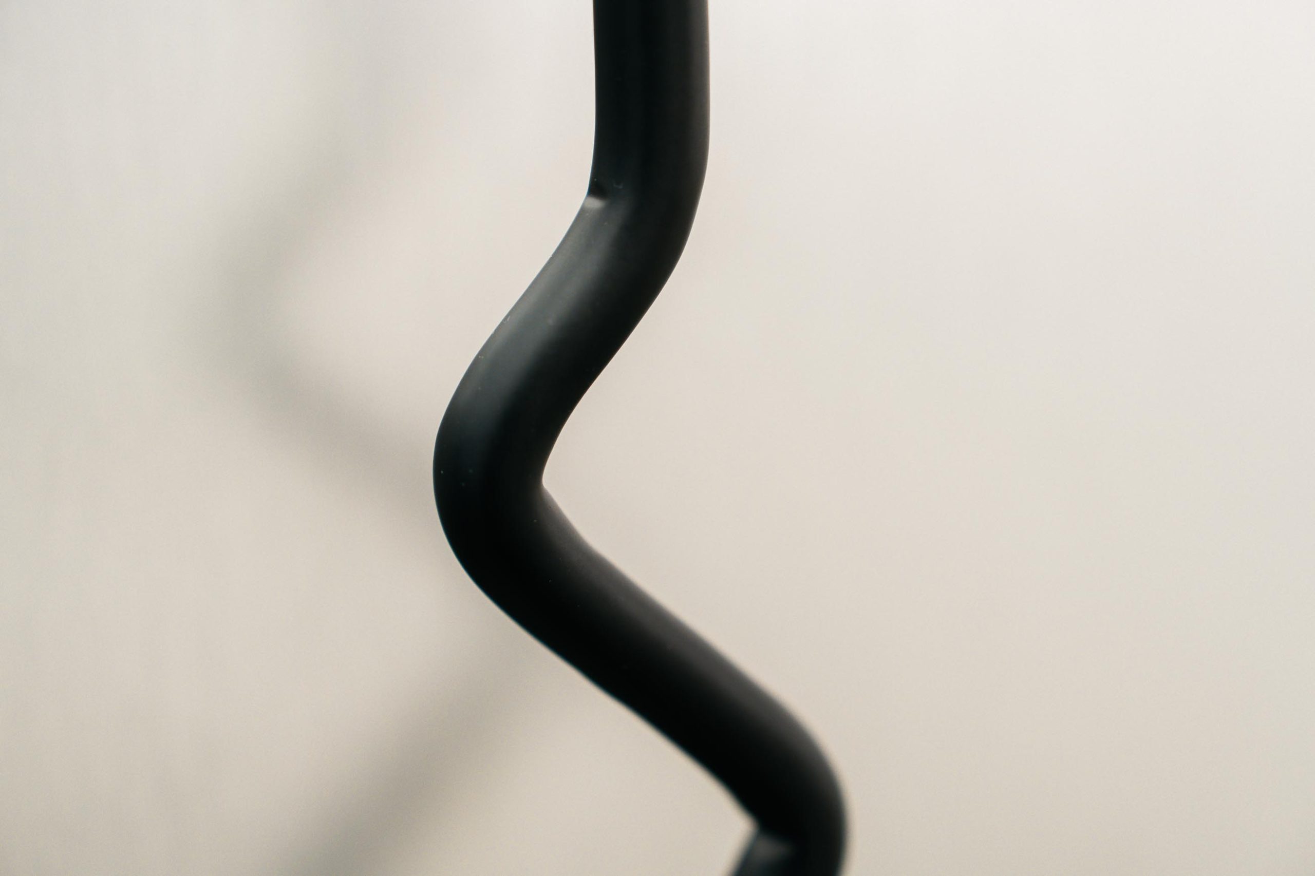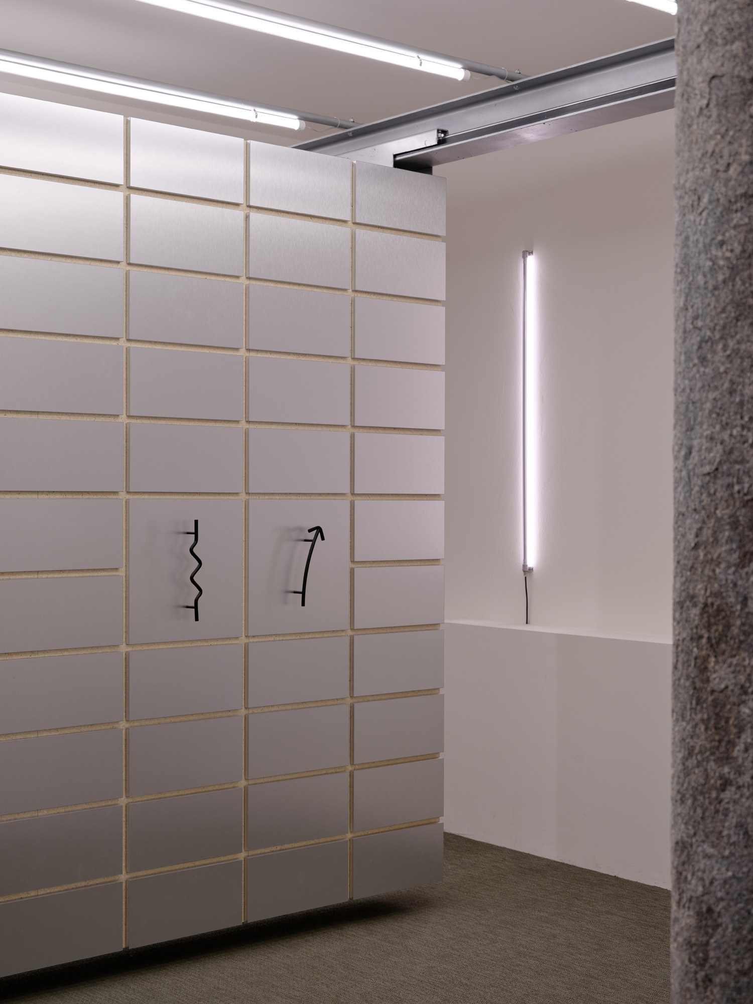


The new handles designed by studio wok — Biscia, Biscione, and Verso — are inspired by the city of Milan, its symbols, and its metropolitan fabric. Their shapes emerge from the transformation of essential graphic signs into immediate and iconic three-dimensional forms, interpreted with a touch of irony that draws from pop imagery and urban language.
“The three elements designed for Verum, although different in shape and size, pay homage to the city’s urban identity with a discreet yet representative presence,” explains studio wok. “A design built around simple yet expressive signs that thoughtfully explores the intersection of visual culture, identity, and design.”
Biscia and Biscione belong to the same family and are defined by a fluid, curved geometry inspired by the sinuous movement of the snake, a historic symbol of the city of Milan. Their continuous profile creates a soft and dynamic line, transformed into a handle through a controlled and clearly legible volume. While sharing the same design language, the two models differ in scale and proportions, offering variations suited to different contexts.
Verso, on the other hand, takes its inspiration from the archetype of the arrow: a direct, universal symbol often found in urban signage. Here, direction becomes volume as a line is transformed into an everyday object, highlighting the ambiguity between functional gesture and graphic sign. With a strongly distinctive character, Verso conveys simplicity and immediacy through a symbolic and sharp design.
Made from solid round bar, the three handles stand out for their strength, ease of use, and great versatility, making them easily adaptable to different contexts and aesthetics.


